
DeeperDive engagement insights
Summary
The DeeperDive engagement dashboard delivers top-level performance metrics alongside strategic insights on user sentiment, popular audience questions and realtime interaction trends. More than just tracking impact, the data can readily inform content strategy, determining not what pages have the most pageviews, but what questions and topics users are more deeply engaging with. It’s about conversations not clicks.
Navigation & Controls
The primary controls of the DeeperDive engagement dashboard are a date-range selector and two filters on device and page type. These controls cascade down the page and limit the metrics shown.
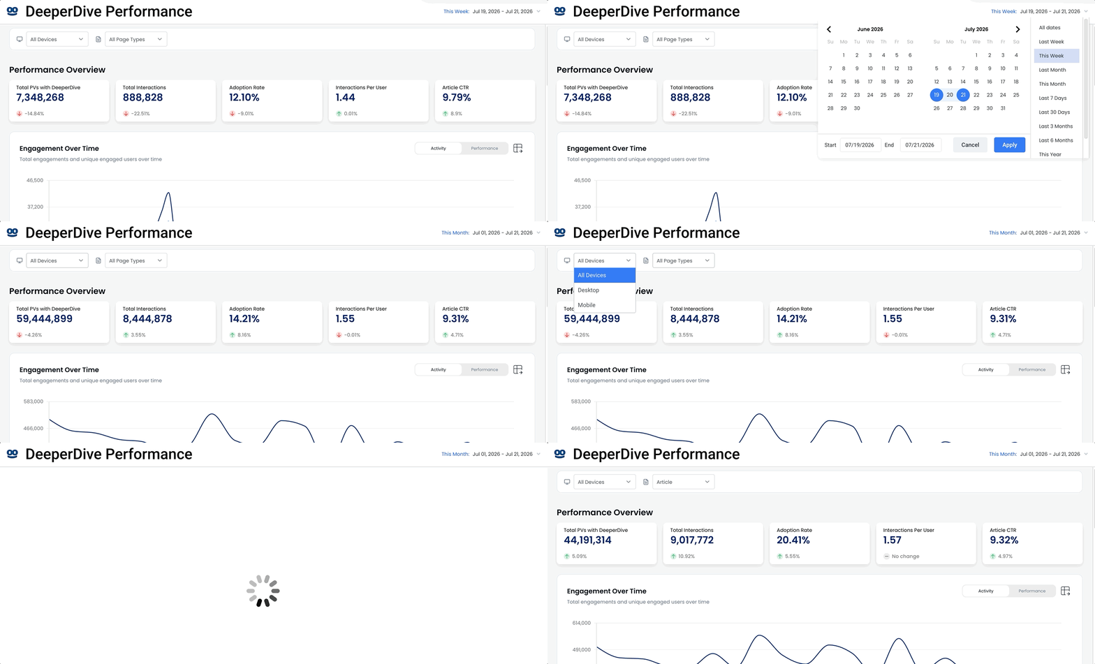
The date selector in the top right allows a user to select from fixed date ranges, like “Last Month” or “This Week”, or variable date ranges. The default setting is the current month.
The dashboard displays all data in the publisher’s configured time zone rather than the user’s local time zone.
Combining date picker with the device and page-type filters, a user could analyze how many questions were asked last week only on mobile article pages.
To download as a CSV file the raw data powering this or any of the following sections, click the download icon in the top right of that specific dataset.
Performance Overview
The overview section is focused on cards tracking the five key-performance indicators of DeeperDive. Those five categories are: total pageviews with DeeperDive, total interactions, adoption rate, interactions per user and article click-through rate.
In each card, there is top-level metric and a green, red or gray trend arrow showing the relative performance of that metric against the prior symmetrical date range. If you select “Last Week”, the trend arrow will show performance of that week against one week earlier.
Metric definitions:
Total PVs with DeeperDive: The number of pageviews where DeeperDive units were rendered.
Total Interactions: The sum of free-text questions asked, clicked suggested questions and summarization requests.
Adoption Rate: The number of interactions divided by the total pageviews with DeeperDive
Interactions Per User: Average number of interactions per use of users who interacted with DeeperDive
Article CTR: The click-through rate on related articles on the DeeperDive surface
Engagement Over Time
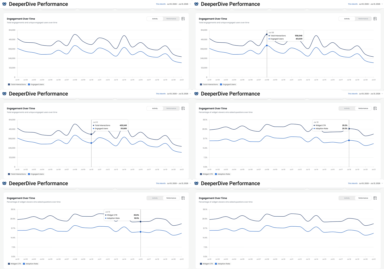
The primary visualization is a double line chart illustrating engagement trends over time – either by day or by hour. Data for the dashboard is updated every 15 minutes. If a user selects a date range greater than three days, the chart defaults to trending by day. If a user restricts the date to three days or fewer, the chart and data are visualized by hour.
A valuable approach to use the dashboard is to select only the current day. Not only will the chart highlight total hourly engagement, updated every 15 minutes, but also what questions users are asking and engaging with that day.
The chart visualization is tabbed. The top layer titled “Activity” illustrates total interactions and total users engaging with DeeperDive. The bottom tab, titled “Performance”, tracks visible click-through rate (vCTR) and adoption rate.
Question Analysis
This section consists of two datasets: a ring chart showing the breakdown of question types and a table of the top questions.
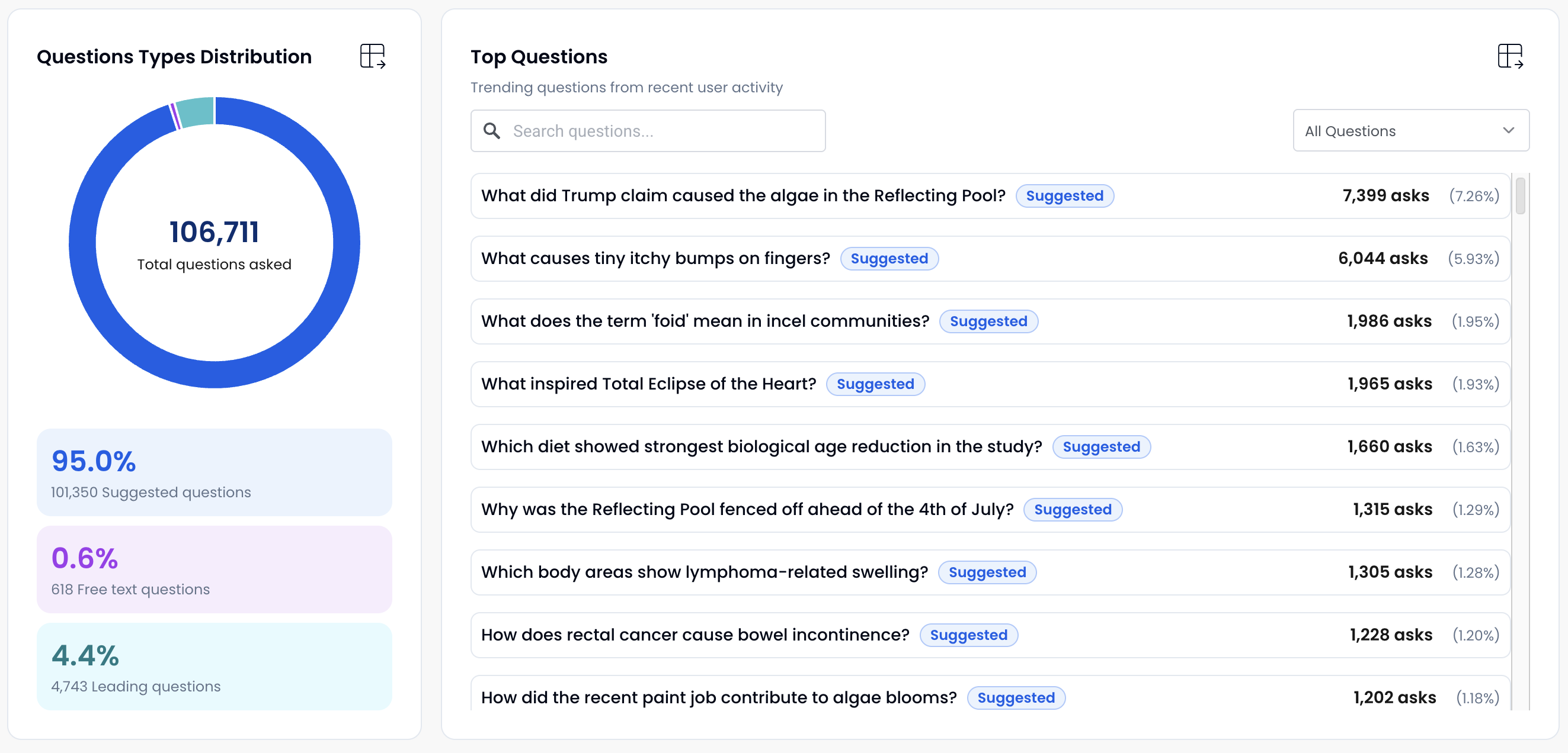
The ring chart will highlight the total number of questions, as well as the distribution of suggested questions, free-text questions and leading questions. Free-text questions are manually entered by users in any of DeeperDive’s open-text fields on the widget or response surface. A leading question is a yes/no question below the response on the DeeperDive surface.
If a user says “yes” to a leading question, it’s tracked not by the “yes” but by the full text of the question they are interested in.
The Top Questions field is sorted by highest to lowest engagement. There is an open text field, allowing a user to search for keywords in all the questions. There also is a pulldown to filter by question type. Combining these tools, a user could search for all the times a user asked a question containing the word “recall” among only free-text questions.
The download functionality is limited to what data has been loaded into the dashboard. To get an extract of all the questions asked, scroll down to the bottom of the list to expose all the data before clicking the download icon.
Sentiment Analysis
The section tracks the use of the thumbs up/thumbs down icons on responses or summaries. Structured like the Question Analysis region, it’s comprised of ring chart and a table.
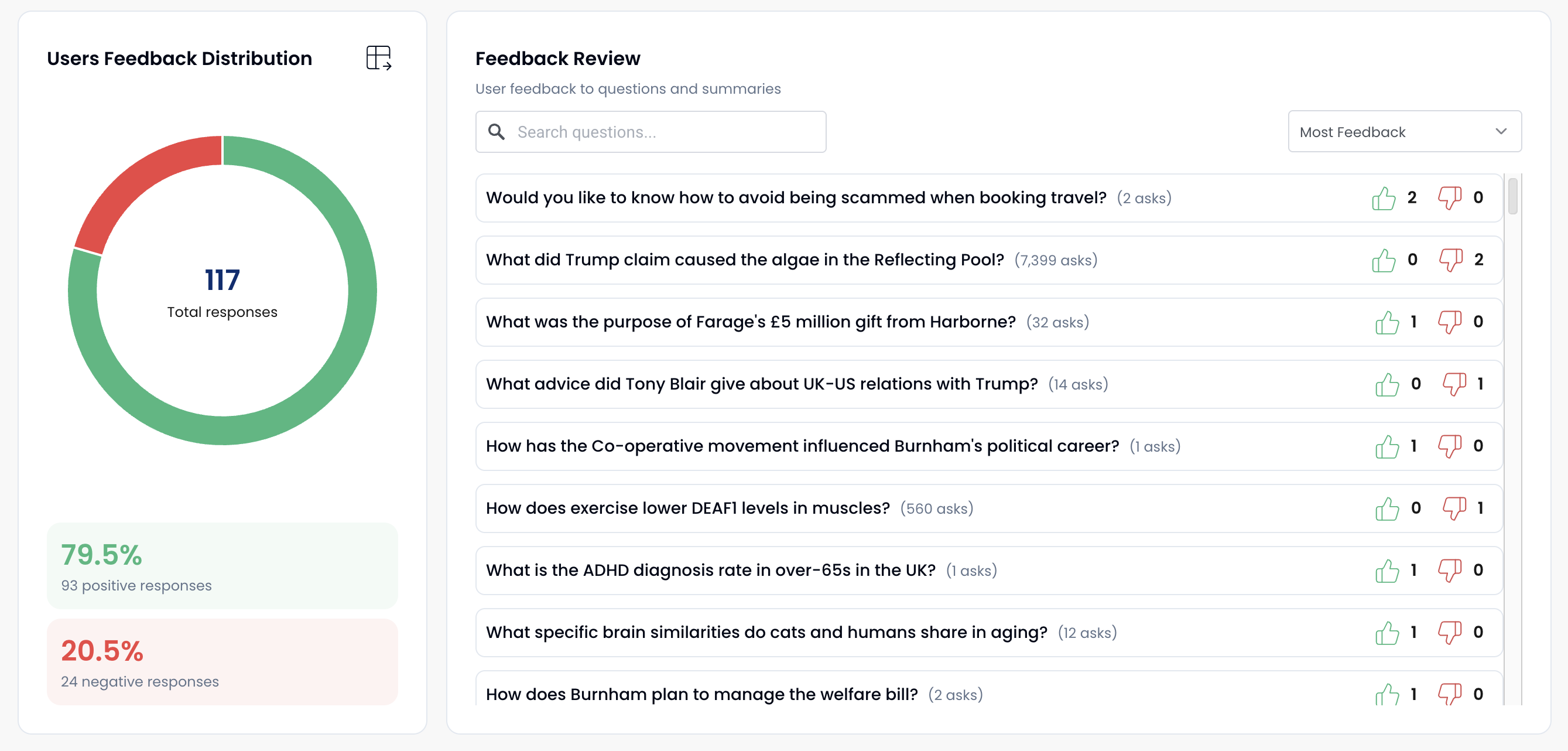
The table has a search field and a pulldown allowing a user to select Most Positive, Most Negative and Most Engagement – the sum of both positive and negative.
Engagement Analytics
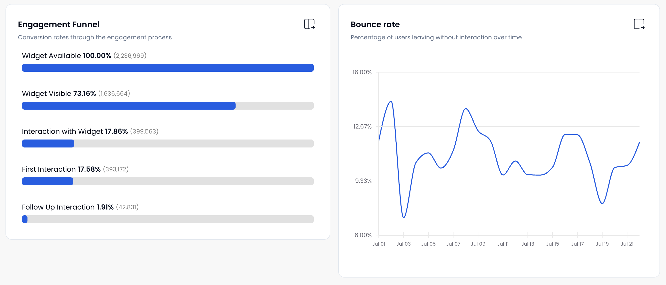
The final section of the dashboard consists of two regions. The first is an engagement funnel showing conversion rates through the engagement process.
The steps shown are:
• Widget Available
• Widget Visible
• Interaction with Widget (clicking into the widget)
• First Interaction (asking a question from the widget and opening the DeeperDive surface)
• Follow Up Interaction
Note: Adoption rate is calculated from questions being asked not just activating the widget.
The second visualization shows bounce rate over time. Note: This is not the traditional bounce rate metric where a user leaves a site, but the percentage of users who ask a question or click on a suggested question and exit without waiting for the response.