Topic Insights Dashboard
Topic Insights is a visual dashboard that helps you understand what topics are trending on your site, across the Taboola network in your country/language, and what your Repeat Visitors are reading about.
The Topic Insights dashboards are created based on a combination of Natural Language Processing and our own machine learning algorithms which determine what topics are included in a story.
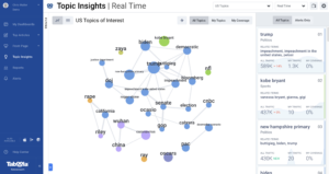
Topic Graph
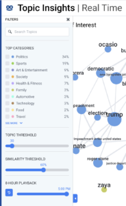
The default view that appears on the Insights Dashboard is the Topic Graph. This is a highly visual representation of what is trending in your country in real time. It will update every 30 minutes, showing the topics for the most recent 30-minute bucket of time available. The graph makes it easy to not only see what topics are currently trending, but topic correlations that can help you and your team find multiple angles for articles. Each bubble represents a single topic.
If a topic bubble is flashing, we haven’t seen traffic on this topic until the most recent 30-minute update.
List View
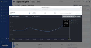
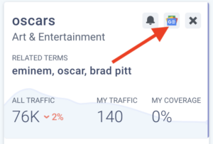
You can use this icon to switch to a “List View’ which displays the same information in a simple list. You can click on any topic to see that topic’s traffic over time on the Taboola Network and on your site (see below for more info on this).
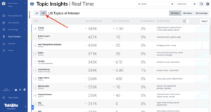
If you’re unfamiliar with a topic, you can click this icon on the dashboards to open a Google News search for that topic in a new tab.
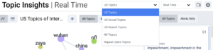
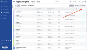
All Topics vs. My Topics vs. My Coverage
At the top of the page, you can filter by All Topics, My Topics or My Coverage. Here is what these options mean:
- All Topics – This displays the popular topics across the whole Taboola network in your country and language. If you have questions about the Taboola Network, please reach out to your Newsroom Engagement Manager or newsroom-help@taboola.com.
- My Topics – This displays the popular topics across on your site only
- My Coverage – This displays topics for all for the whole Taboola network, while indicating your market share of that specific topic. This view helps you decide if you want to cover specific topics you are missing out on.
- Dark blue circles: You have no traffic for that topic.
- Light blue circles: You have some traffic for that topic, with the amount of your traffic represented by a green inner circle.
Coverage is the percentage of pageviews for a topic that we see on your site, compared to the pageviews we see on the Taboola network.
Filtering the Topic Insights dashboards
If you click the “Filters” panel on the left, you can filter the dashboards in a number of ways:
- In Top Categories, you can choose to only show topics in specific categories
- The Topic Threshold determines how many topics are shown
- The Similarity Threshold determines when we show a correlation line between topics – moving the slider higher means we’ll show fewer lines
- The 8-hour playback allows you to look back at previous 30-minute updates, or play them on a rotating basis.
Changing Dashboards
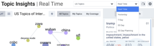
By default, we’ll show you information for all traffic in your country and language. Your site likely will also have access to different dashboards that filter the topics we show by Search and Social Traffic. You may also have access to traffic filtered to a specific locale, such as a State in the US. You can access these with a drop-down in the upper-right corner.
The ‘Repeat Users’ dashboard is particularly useful – this will show you the topics that your repeat visitors (people who have been to your site twice in the last two weeks) are reading around the Taboola network and on your site.
Changing Time Frames shown
In addition to the Real Time reports, you also have access to see the same data and reports for different time frames using the drop-down in the upper-right corner. You can see the same reports for Yesterday, the previous 7 days, and previous 30 days.
The “30 day Planning” dashboard will allow you to explore what topics have trended over the last 30 days with a different interface. It can be used to see what was popular in a particular category, and see your site’s performance compared to the network for specific topics.
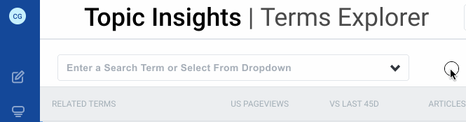
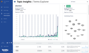
Terms Explorer
Search for trending topics that are relevant to your audience, discover related terms driving additional traffic and track readership data across the open web.
Open Terms Explorer by going to Topic Insights using the left navigation and then selecting “Terms Explorer” underneath or click here.
What is Terms Explorer?
Terms Explorer in Taboola Newsroom uses 90 days of traffic in the Taboola Network so you can easily find and explore trending terms and related topics across the open web.
This powerful new feature of Taboola Newsroom allows you to:
- Expand coverage and create follow up stories
- Improve long term content strategy around topics that have consistent traffic
- Identify reader interest in specific terms and traffic patterns for media team use
What can I use Terms Explorer for?
Here’s how 3 publishers have found success using Terms Explorer:
1. Expand coverage and create follow up stories around related terms that are connected to the primary story.
One publisher analyses their previous day’s coverage of a particular topic to identify related trending keywords they may have been missed.They then assign follow-up stories based on terms getting significant traffic and reader interest.
In two of our blog posts, we demonstrate how this works:
The first shows an example of a keyword “farmers” which spiked in pageview traffic and shows publishers how interest in the topic significantly increased within a short period of time:
https://blog.taboola.com/how-the-coronavirus-pandemic-affected-readership-in-india/
The second explores pageview spikes after significant events (“Trump vs Biden: When Did Readership Spike?”) to help editorial teams understand its immediate impact on readership:
https://blog.taboola.com/heres-what-us-readers-are-focusing-on-ahead-of-election-day/
2. Long term coverage strategy planning around terms that have consistent traffic or events.
Another publisher reviews traffic patterns around recurring events to plan their coverage strategies over a longer period of time. This can be especially useful when looking at sports seasons, reality tv shows and any topic that develops in an ongoing or periodic manner. In doing this, it ensures that when they publish content it will get maximum traffic and interest from an audience already interested in the main topic.
3. Identify reader interest in specific terms and traffic patterns for sales, marketing and other non-editorial parts of the publisher organization.
A third publisher creates data infographics for its sales and marketing teams. They incorporate that trend data into sales collateral and post to social media. Source: 7NEWS.com.au
How do I use Terms Explorer?
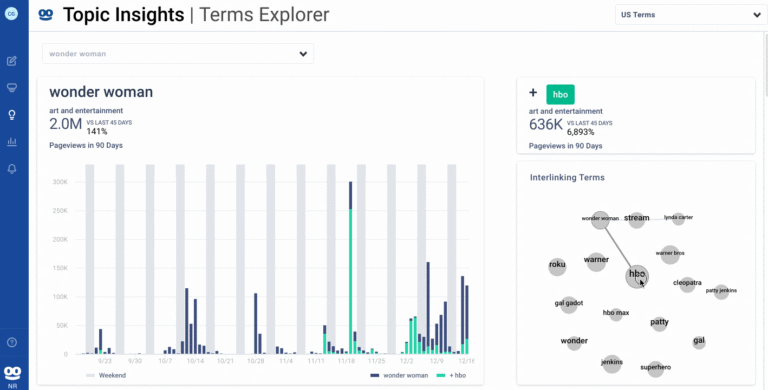
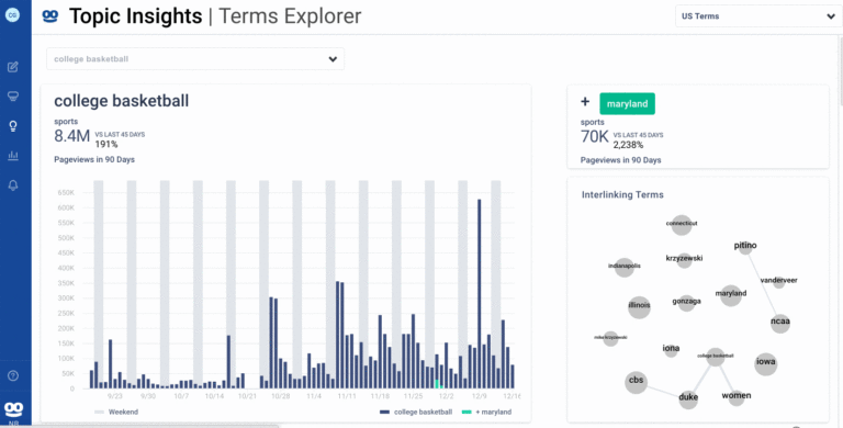
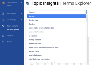
To get started select Topic Insights in the left navigation and then select Terms Explorer underneath. Once the dashboard loads, you can see what is trending by pageviews and select that term for more details or search for a term using the autocomplete search box at the top. The search box is auto completed as you type and sorts terms downward by traffic.
Once you select a term from the trending term list, or via the search box you will see the 90 day traffic details on that term. This will allow you to formalize a writing strategy for short term or long term around sustained pageview traffic.
While in the 90 day traffic view on the term, you can select a related term to see how it impacted the traffic of the primary term selected. Lower on the page you will see a list of the related terms where you can see one of the articles included in the traffic by random sampling as suggested by Taboola’s proprietary algorithm.
A term will show up if it has been seen in at least 6 articles in that region in the past 90 days. A connection will be created to other terms if both terms are present in at least 6 articles. Our Graph AI uses context between the terms to form connections between them and more can be read on our blog post here. Download the one sheet here.
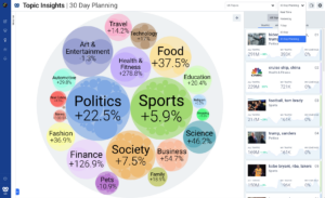
30 Day Planning
Under the top right date selection drop down you will see 30 Day Planning. This insights view allows you see how interest in topic clusters has changed in the past 30 days (last 15 days compared to previous 15 days). The top level category bubbles will show a % of change with positive % meaning that more people have read about topics under this category.
Click on a category bubble to drill down up to two levels deep. The right side of the dashboard will list the topic clusters that are currently in the selected category bubble with network pageviews, your current coverage and if the traffic trend is up or downward. The topic detail card, when clicked on shows pageview traffic and article counts for the network and your site for the past 30 days. In addition, there is a list of similar articles found on the network and on your site under this topic cluster.
30 Day Planning is a great view into how audiences interest on the network and on your site is changing at a higher level over time so you can plan changes to your coverage in these areas. The article counts is valuable to understand if there are significant opportunities to cover viral topics.
Exporting Data
In the “List View”, there is an Export button that you can use to export data for the top 200 terms for your selected audience segment to CSV. Note that the exported data is not filtered if you have any category filters selected in the UI.
Important Note on Privacy
Due to our stringent data protection and confidentiality policy, we never identify specific sites or articles a unique user has visited. We show you the topics that your users have read about on your site, and what they have read about on the rest of the Taboola network in aggregate. You will never see data identifying any specific competitor or group of competitors, and similarly we never show your specific traffic data to any other sites.