Top Articles Dashboard
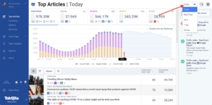
The Top Articles Dashboard provides real-time traffic data for all article pages across your site. This high-level view is a great way to get a comprehensive look at your site’s activity. It gives you important insights into your readers and how they consume your content.
Newsroom reporting only shows data for article/gallery pages of your website that have a Taboola Feed or widget implemented. By default, we filter out your homepage, section fronts, and other page types.
Filter By Traffic Source
At the top of the Overview Dashboard, you can filter by the following traffic sources/referral types. These filters can help you drill down and see your top article traffic drivers, separated into major referral categories:
- Total Pageviews
- Social
- Search
- Direct
- Other
The green/gray/red vertical bars show how each referral category is doing compared to baseline for your selected time frame.
Dark social traffic is traffic that we can’t detect where the user came from and goes directly to your articles. This can include traffic from email newsletters, IM clients and apps of all kinds. We follow the typical industry practice of categorizing dark social traffic under “direct.” Traffic we report under the Social tab is only for identified traffic from known social referrers.
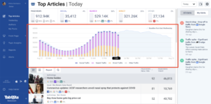
Bar Chart and Baseline
For each traffic source tab, there is a bar chart which represents the traffic for the time period selected. There is also a curve that represents the baseline performance for this segment of traffic over the last seven weeks (or last day of week in Today view), so you are able to assess at a glance how your site is performing against its usual performance levels. You can learn more about baselines here.
Filter by Section
If your site uses sections, you can filter traffic by section. To filter by section, use the dropdown in the upper right corner or click on the section name of a specific article. You can also click the “gear” icon in the upper right corner to select a section or use your primary section.
Filter by Author
To filter traffic by author, click on the author name of a specific article and the dashboard will filter to only articles with that author’s byline.
Date Ranges
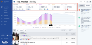
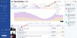
Newsroom offers many different date ranges to view data on depending on your need. At the top right corner you can select Today, Real Time, 24hr, 7 day and 30 day.
- The Today view shows a fixed 24 hour midnight to midnight window with articles that have had traffic just for today. It will fill in as your day progresses against how you did in the same day of the week previously. This view updates every 1-2 minutes and offers sorting by pageviews for today and pageviews real time in the past minute, which is great for a fast moving look into what users are reading right now.
- Real Time view shows what users are reading in the past minute with updates every 1-2 minutes. It also offers sorting and selecting by engagement scores. It is recommended to utilize the Today view with real time sorting over this date range to look at how your site is doing right now.
- 24 hour view shows what users are reading in the past 24 hours with updates every updates every 30 minutes. It also offers sorting and selecting by engagement scores. It is recommended to utilize the Today view with pageviews today sorting over this date range to look at how your day is progressing.
- 7 day / 30 day views are good for showing historically how you are performing and updates daily. They offer sorting and selecting by engagement scores.
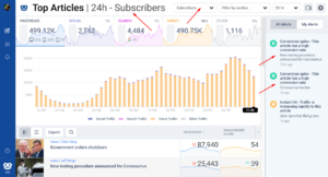
Article Alerts
On the right-hand side of the dashboard is a view into article alerts across your website. You can choose to view all alerts, or just alerts that you’ve selected in My Alerts. These alerts are filtered if you have a section or author filter selected. See this article for more information on configuring My Alerts. You can also go to the Alerts Dashboard to see all alerts for the last 24 hours.
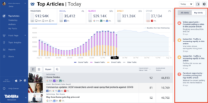
Article Details
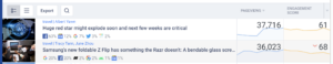
At the bottom of the Overview Dashboard you will see a list of top articles, ordered by number of pageviews over the selected time period. Keep in mind this list will change as you filter by traffic source, section and author.
In addition to the title, author and section of the article, here’s the information you are able to see by article:
Top Traffic Sources: Under the author and section, you will see an icon for the referrer and the percentage of traffic the referrals have provided as long as that traffic source is over 1% of traffic.
Page Views: To the right of the article title, you will see the total number of views your article has seen over the chosen period. The red and green arrows to the left of the pageview number show how your article has been trending over your selected time frame. A double arrow (versus a single arrow) means the velocity is unusually fast for the increases or decreases in traffic.
Trend Line: A four-hour view into recent performance, shown on views of up to a 24-hour window.
Engagement Score: This score combines six metrics into a single performance score to show, content stickiness, and reader action for each article you place on the Taboola network. Learn more about Engagement Score here. You can click at the top of the column to show an individual score or the raw metric for each of the six metrics.
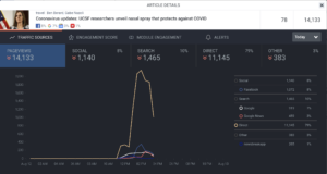
Next, if you click on an article, you will see more details on that article specifically. Here’s the information you are able to see:
Traffic Sources: Here you can view all of the traffic sources for the chosen article. You can also select which sources you’d like to appear in the graph – either by source or by category.
Engagement Score: This score combines six metrics into a single performance score encompassing initial reader interest, content stickiness, and reader action for each article you place on the Taboola network. Learn more about Engagement Score here.
You can customize the weighting of each metric to meet your unique editorial and business goals. Reach out to your Newsroom engagement manger, or newsroom-support@taboola.com to configure.
Module Engagement: Here you can view 2 types of engagements with your article:
- If an article has a video, you will see the number of impressions, engagements and watches (30 seconds or more) the video has.
- If an article has social share tools, you will see the number of times a user engaged with them in the “shares” section.
Alerts: In this tab, you can see the alerts that have been generated for this article over time. For more information on these alerts, see here.
In this view, you can also filter by time at the top right of the section.
Exporting Data
You can use the “Export” button to export data for the top 100 articles to CSV. Note that if you have an author or section selected, the exported data will be filtered in the same way the UI list is filtered.
Conversion Tracking
Newsroom can help you see which articles are converting the most users to subscribers if your site has a subscription system such as a dynamic or metered paywall. After enabling tracking, you will see total conversions in the top left total traffic card for each date range you have selected. Additionally, both raw conversion counts and the ranked conversions score is available in the article list engagement score drop down to sort from. If an article starts to convert users at a higher than normal rate, or starts to drop in conversions an alert will show in your alert right rail. You can also subscribe to receive notifications on Conversion alerts under your Manage Alerts setting. Please contact your account manager to inquire about setting up subscription tracking.
With subscription tracking enabled, you can see what your registered or subscribed users are reading using the drop down at the top of the dashboard. Registered users are ones that have logged into your site / signed up for your email newsletters, while Subscribers are paying customers. This filter is currently available in all date ranges except for Today.